Wednesday, August 29, 2012

Victorian Botanical Styled Wedding Shoot

 
We were so lucky to have been asked by local photographer Heather Roth to help her set up a styled wedding photo shoot.  She is so talented as you will soon see from the pictures!  We also got to work with several other local women who I will be mentioning here. The theme was a Victorian botanical feeling made to seem modern.  I hope you are inspired and get some ideas about how The White Rabbit can help you make your own wedding unique!
 
This is where we shot the photos.  It is basically an old farm that can now be rented for events.  It's called Longview Farm House.  I would highly recommend this space because it is beautiful and everyone that works there is so helpful and pleasant.  They were great to work with and I'm certain that they would make your event special!

Below is an old wire tray from our store which Heather used to display the invitations by One Canoe Two.  She told them we wanted a fern theme with a modern twist. They made everything totally custom for us.  I think they did a great job!  Love the colors!
 
 Heather brought her mom's old boots for the bride to wear.  The chair is from The White Rabbit and it actually has a home at Fleur De Lis Bridal in Clayton, the boutique that provided the gorgeous dress you are about to die over!
 
 See what I mean??!!  The dress!  Oh my heart almost stopped when I saw it.  It's from Fleur De Lis Bridal Boutique and designed by Elizabeth Filmore.  You have to visit them if you haven't already.  Connie and Kristin have gorgeous dresses you don't see in St. Louis and they will make you feel like you are their priority.
 
The wallpaper behind her was our new temporary wallpaper.  We just hung strips from the ceiling to give it some texture.
 
 This is Rachael, a real life Barbie doll.  And yes, her husband is adorable too.  They were so sweet to put up with us for like 10 hours!
 We brought some of our fern garland from our garden area of the store.  Heather thought of wrapping it around her.  How cute!
 
 This old baby bed doubles as a settee.  When we picked out the gold and cream wallpaper for the wall, it just seemed like an obvious choice to put this settee in front of it.  Doesn't she just look glamorous on it?
 
 
 We often have chippy, old doors in the store that look so cool just leaning up against a wall.  It adds character behind a sofa or in a corner.  I love this one we put behind the bride!
 
 Heather saw these trellises in our store and thought of using them for the place cards.  She printed the banner that says, Plant Your Feet and Find Your Seat.  I love the way it turned out!
 
 The table, chandelier, curtains, and trellis were our contribution.  Boy did we spend some time trying to get it to look perfect!  That darn twiggy stuff inside of there just wouldn't spread out evenly!  It's so hard to work with! 

We have this chandelier in the store right now.  It's really pretty for a wedding isn't it?  I love the long dangling crystals.
 
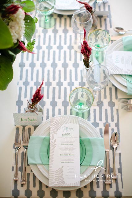
Katie from Simply and Forever, an event planning company, set the table.  She made a lot of decisions when everyone else was running around without any focus.  I guess that's why she's a good wedding planner!  She was able to pull everything together and make it look perfect.
 
All of the gorgeous flowers were done by Melinda at Les Bouquets.  She brought a lot of great options for centerpieces and a lovely bouquet for the bride.
 We sell these chalkboard bottles in the store.  It was used here as our table number.
 
 
 The cake we used was made by Rachel's Cakery.  Heather had a vision of a cake without frosting on the outside surrounded by ferns.  I have noticed a trend on Pinterest of cakes without frosting.  Very cute.  The white table is from our store.


 The mantel display items are from The White Rabbit too.  These little glass jars are awesome because you can change them up for all the seasons and use them for special occasions.
We raised them up using old books which is basically our favorite old trick.

 Love this little cake stand and dome.
 
 Gosh they are so cute.  I can't think of a better looking couple!  Rachael and Kevin told us they met in church.  Aww...
 
 
 We brought a really tall step ladder because Heather thought it would look really cool for the bride to stand on it with her dress hanging down.


 Here's Ken..I mean Kevin lol.

We all put a lot of love and care into this photo shoot and I really hope it shows.  You can see how our vintage pieces could make a wedding unique!  We have had a lot of brides buy the pieces they want to use and then incorporate them into their homes after the wedding.  It actually makes sense to make an investment in things you can use again.  We always have gorgeous tables, linens, curtain panels, domes, cake stands, pots, urns, etc that could work in a wedding.  Let us know what you think! 

Thank you to everyone who helped us along the way!  It was truly a group effort!

Monday, August 27, 2012

Put a Little Glamour in Your Halloween

We are so thrilled with the look of our Halloween decor this year.  We ordered it in January and had a black, white, and tan theme in mind.  There are touches of orange and a little bit of glamour.
  Don't you just love the look of a classier Halloween? I don't understand why so much of the Halloween decor you see in stores is so cheesy. It's all plastic and shiny. Why can't Halloween be pretty AND spooky? 

We had these jeweled pumpkins last year and sold out of them instantly so we got several sets this year.
 
Old top hats are so cool for a Halloween table.  You can fill them with pumpkins or put them on top of a skeleton's head.  We used some hay to add a special touch to our top hat and pumpkin.
My favorite part about the pumpkins we sell is their twisty stems.  So cute!
 Susan from Knollwood Lane made some fun pennant banners with different images on them.  I love this BOO banner.
 We pretty much believe that you can never have too much glitter!  These are glass glitter pumpkins.  They are $8 and $12 each.


 I love the hanging witch in the moon.  She is so cool.  We ordered her from the Bethany Lowe showroom.

 
Halloween decor looks cool against the temporary wallpaper from my recent post. We made it even more glamorous looking by mixing in mercury glass and old silver like the tray and candleholders below.

 They're watching you....
 These boo blocks have been really popular because you can put them anywhere.


 I ordered the black candleabra for our display a long time ago.  I just knew it would be perfect!


Another cool Knollwood Lane creation.  Susan made door hangers like this skeleton one below.  I love the glass glitter.

 
People have been so tickled by these Ouji board placemats.  We've been collecting them for a few months so we'd have enough to make a whole table setting.
 We've also been collecting the white ironstone for our table.

Mr. Crow is wearing a crown.  He's so fancy. 
 
 These silhouette ornaments are really cool.  It's one of my favorite things we ordered this year.
 
 
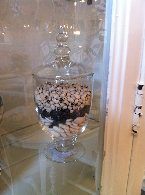
This is a fun, inexpensive way to decorate for Halloween.  I bought one bag each of white lima beans, black beans, and black eyed peas.  You can fill jars in layers with them or use them to fill in around displays.

 
We can make you a gorgeous bow for your fall wreath this year.  Just stop in and we will help you pick the ribbon and make whatever size you need.


If you are in the St. Louis area, I hope you can come in and see the Halloween displays in person.  We will be happy to help you pick out the right pieces for your mantel, table, cabinet, or front door.  We can always ship things too!  Just give us a call at 314-963-9784 and let us know what you saw on here that you want.  I'll send it right out.

We are working on planning a pumpkin decorating workshop for September too!  I can't wait!  I'll post about that when we figure out the details.

Saturday, August 18, 2012

Grand Opening Fun at East and West, a new boutique


We are so excited about our new friends Brian and Lauren Simpson who have recently opened a wonderful boutique in downtown Kirkwood.  They came in to The White Rabbit hoping to find cool display furniture for their store called East and West, a clothing boutique inspired by designers from the coasts.  The two saw a need for a quality shop where men can find brands made in the U.S. that you just won't see anywhere else in the Midwest(there are a few things for the ladies too!).  We were thrilled to help them find unique pieces for displaying their wares. 
We recently visited them during their grand opening event and snapped some photos of the pieces they got at our store! 
It was so fun to see it all come together.


This is Brian and Lauren in front of a cabinet they bought for their line of men's skincare and grooming products.  I will definitely be visiting this cabinet for my brother's Christmas presents!
P.S. Aren't they kind of ridiculously cute??


They got this red table recently and I almost shed a tear when it left our store.  It has a rusty metal top and it came in with this red, flat paint. Awesome!
 They bought this banner for their wall which is perfect because it has the names of New York subway stops.  This is our best selling website item by the way. They put a ladder in the window and draped jeans and shoes from it. 

This old Brach's candy display shelf turned out to be the perfect piece to display their candles and colognes. We had JUST gotten it when they snatched it up! 
See the  leather bag on the crate next to it?  My boyfriend got it for me. :)

 We painted the top of this table with chalkboard paint so that he can write sizes, prices, messages, etc.  It was a really simple table but adding the chalkboard top makes it a little bit more special.


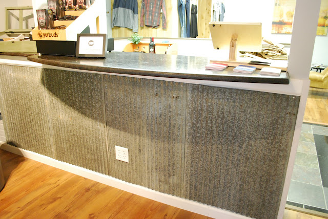
 We had these sheets of galvanized metal at the store and Brian thought it would be really cool to use as his checkout counter front.  What a fun idea!  I love re purposing old materials like this.


This chalkboard came from us.  Looks great! The table below is metal.  I love mixing some industrial elements with painted pieces.  It keeps everything from looking too matchy and formal.

We helped them create a collage of frames to go above a clothing rack.  Don't you love the colors they chose?  They were a little too bright to begin with so we used a brown glaze to make them look older.  Glazes are easy to use.  I would really recommend experimenting with them if you haven't yet. 
 Want to visit this new boutique? They are at 205 N. Kirkwood Rd, kind of across from Deweys Pizza.  You can also visit their site at http://www.eastandweststl.com/

Please be sure to tell them The White Rabbit sent you!