Saturday, October 5, 2013

You're going to love this pool house re-do!


So when our friend Susan told us that she was renovating her pool house I pictured the typical, safe beach theme that everyone uses.  You know it what I'm talking about; the fish, the shells, the aqua color on the walls, fake surfboards, Hawaiian flowered bedding, etc.  Boy did I guess wrong!  She managed to create a multi functional open space that is both comfy and stylish by using a little creativity and some color common sense.  As soon as I walked into the space I thought, "My customers are going to love what she did!" 

Not only does Susan make awesome décor, gifts, and jewelry for our store and for her website (Knollwoodlane.com), but apparently she can decorate like a pro!  Who knew??


Above is the outside. Gorgeous.

Below are 2 bronze goats that were her Mom's.  This is definitely a family of animal lovers.


When you walk in, you can see this big open room to your left.  The first thing that strikes you is how clean it feels.  She decided to go with white walls and ceilings so that any color in the room would pop out.  Sometimes color used sparingly can have even more of an impact than a lot of bold choices. 


The bathroom to the right has a vintage chandelier she got from her mother-in-law and sprayed white.  She hung a bright blue bookshelf on the wall to house all of the colorful towels.  I love that she went with white for the chandelier because she knew she'd have a lot of color in the towels.
 

The first thing that happened when I walked in with my camera was that the puppies followed me and wanted to be a part of the fun.  Here's Grits posing on the sofa that Susan slipcovered in dropcloth.  Yes, dropcloth from the hardware store.  It's super cheap and once you wash it, it's soft enough to sit on.
All of the curtains are also made from dropcloth!
 Since she had a huge space, she got 2 rugs from Ballard Design and turned them to make them fit the space.  I love the touch of chevron. 


Once Grits got his photo op, Daphne had to get in on the action.  Here's the little stinker on the zebra chair we found during a trip to market.  I love that she wasn't afraid to put a zebra patterned chair with a chevron rug.  Most people are afraid to mix patterns together but it looks amazing!  Isn't Daphne cute?!?!?! 


If you're curious about the pillows, Susan makes them!!  We have a ton of her wonderful creations in the store but she also has a website.  Here's the link to her pillow page.  She doesn't have the one with her family's last name on the site but I'm sure she'd make you a custom one if you sent her a message!

And now onto one of the coolest things about the space; the bunkbeds! See how she angled the chairs in front of the bunk beds to section off the areas?  My mom always says that people need to avoid "circling the wagons" or, in other words, placing all of the furniture around the room against the wall.  Let your furniture create divisions in a large room.  I know it can be tricky but once you scoot it into the right place, you'll look like a design expert. 


The built in bunkbeds are cool for so many reasons.  First, Susan made the headboards herself.  She used plywood, batting, and dropcloth.  She prints a lot of fabric for her business, knollwoodlane.com, so she printed these adorable silhouettes of her dogs on each headboard.  Then she just attached them to the wall above the bed.  How cool!!  We found the bedding from one of our wholesalers at market.  I love the texture.


Don't you want to climb up there and have a sleepover? 

Here's a closeup of the little crown detail she put on the sides of the bunkbeds.


Next to the bunkbeds, Susan had her carpenter build some shelving and storage with a hidden murphy bed in the center.  For the front of the cabinet that houses the bed, she used the front of an old wardrobe she got from The White Rabbit.  She also got the metal M from us.  We sell so many of those!  They're really cool!


Susan also made a little study area with a shabby table and aqua chair.  I love that she left the table totally chippy.  There is a touch of blue in the paint so it goes great with the lamp and chair.


There is even an area with a dining table and chairs.  The bright chandelier above the table is probably my favorite part of the room.  I thought she was a little crazy when we ordered it at market because it is SO bright but now I see how fun it is in the space.  When you use a lot of neutrals, I think it's important to put in some color to keep the space from feeling too serious. 
Hanging the chandelier above the table also illustrates how you can ground an area by hanging something above it.  Even though there aren't any walls separating the dining/living/sleeping areas, it feels separate because the chandelier sort of "owns" the dining space.  The living room feels separate because the sofa is in the center with it's back to the rest of the space.

Don't you just want to get a couple of girlfriends together and play in there??  You could get out some magazines, lounge around looking at Pinterest, and eat some sort of dessert.  Her daughter is in her teens and she gets to have friends spend the night in here.  So jealous!

I hope you love Susan's pool house as much as I do.  I think it's a great example of mixing new and old elements, using creativity to save a little money, and putting really personal touches into a design.  What a fun space! 
Susan makes a lot of things for our store and has just started her own website, Knollwoodlane.com.  Please check it out and tell her Angie and Lindsay sent you!


Thursday, July 25, 2013

Behind the Scenes at Market-July 2013

I cannot believe it's already time to blog about market again!  It seriously feels like I just did this.  I swear that as soon as I turned 30, time went into warp speed mode! If you missed my blog about what we ordered for this Christmas, take a look HERE
 
So now that we're back from Atlanta, we've been reflecting on what we saw there for 2014 and a few things really stood out.  First, gold was EVERYWHERE.  It seemed like anything and everything was gilded(and I loved it).  Second, there were a lot more colors and patterns than we've seen in the past. The neutrals we saw last July seem to have been replaced by some beautiful cobalt blues and emerald greens, among other colors.  The third thing we found was some great new gift lines which will be coming soon for the holidays. The last thing I'm sharing is a few fun displays we saw.   My mom and I had a great time looking for new goodies and I'm excited to share what we found with you!
 
This is the entrance part where you get your badge.  You can only attend market if you buy for a store.


 There are 3 buildings that make up the Atlanta market.  A very confusing series of tunnels at seemingly random floors connects them.  (By the way, if these photos seem, well, not very good to you, it's because photography is actually not allowed at market. I'm basically sneaking you guys in :)
 
 
Here we are in our first showroom of the trip.  We pretty much landed in Atlanta, dropped off our bags, and went straight to market.  We can walk to it from our hotel which is really convenient.


The golds!
Right away, for Spring of 2014, we started seeing lots of gold.  I was really happy because I happen to love it.  It's so fabulous and classic in any room.  Here's some of the gold we ordered:
 
 This chandelier is so chic and would look awesome above our vintage painted furniture. 
 
 I was really in love with this wall of mirrors and animals.  It's a fun mix of vintage and modern which is what we are hoping to achieve for Spring 2014.

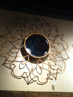
I'm loving the graphic shapes on this mirror.  Above a vintage sideboard or dresser, this piece would add a modern element to a room. 


Now for the patterns and colors!

See the cobalt blue bedding on this linen bed?  Last year, it would have just been the neutral linen.  Now, everyone is adding lots of color and pattern.  I'm actually really excited about it. (I was not excited about the prices in this showroom though.  So high end.  Bummer!)
 
 Here's a photo that shows how the golds look with the cobalt and emerald.  Our look won't be quite so retro mod, but we were inspired by the elements here.  Every year, we reevaluate our "look" and try to stay up to date without losing our vintage roots.  We will always love old stuff.  The trick is to make the old stuff look new and fresh. 
 We ordered some throw pillows in vibrant colors because pillows are the easiest way to get started if you're afraid to be adventurous with color.  The employees have already let us know that they are in love with the pillows so I hope we're on the right track!

 The pillow below is my mom's favorite.  She's thinking about taking it home when it gets here.
 
The prints below look like something we've already had in the store, except they have that wonderful green color around them.  Last year, the frames would have been a neutral khaki or white.
 
 A BLUE clock.  I am so in love with it! 


Now onto the gifts!

We found candles, scarves, jewelry, and some amazing frames to carry for Christmas. 
 
 
Lots of scarves.  Who doesn't love a scarf in every color???
 
Below is the newest creation from the line of paper table runners we carry.  It's chalkboard runners/paper.  I can't wait to wrap gifts in it.  P.S. The whole chalkboard trend looks like it's staying for a while because we saw a lot of it at market.
 
Some delicious holiday scents we ordered.  I really liked the hobnail glass jars they come in.  This is the same line that makes our favorite Fresh Linen and Cashmere scents.  The one we ordered is called Evergreen Seedlings.
 Some colorful jewels for your holiday parties!

We found a few cute things to give to baby too!  These are actually already in the store.
 
We used to have an artist who made frames like these for us.  She doesn't make them anymore but we found these!  Our hope is that you guys will like them just as much.  These are still handmade in the U.S. too.  That is hard to find.

The frames below are going to be a big hit I think.  Wait until you see them in person.  They way the artist does that turquoise patina is just gorgeous.  We got to meet him and he was really sweet.  I hope we sell a lot of his frames.  Some of them are so large and fabulous that they could stand alone on a wall like a piece of art. They are shipping to us on Sept. 17th.
 Below is a new line of jewelry we ordered that looks soooooo antique.  I am so excited to pick out a piece to wear on New Years!!  I also think it looks high-end but it isn't.  That almost never happens.
 We ordered the cute little line of candles and sprays below that smell like a Christmas tree.  I can't wait for the store to smell like this!
 Below is a monogram bracelet that we ordered for Christmas.  It comes with the little charms on it.  I'm pretty sure they are going to be $29 which is the perfect price point for a nice little gift!  We also ordered some individual charms.  The only problem will be keeping track of which letters we need to reorder.  It seems like we never have the right letter at the right time...
 

Fun displays we saw:

Here's the window looking into Park Hill.  They always use real plants in their displays and I'm jealous that they can keep them alive.  My mom and I are not very good with plants.
Um, this display was fun because there were warm cookies inside.  One of the problems with market is that I always gain weight because there are so many snacks in the showrooms. 
 
I'm always blown away by Gina's displays at Peacock Park.  Look at that spiral staircase!  Awesome!


We ordered the ridiculously long table pictured below and it actually beat us home.  It's in the store now.
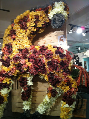
A giant giraffe made of flowers.  I love him!!


You might not be able to tell but the branches and urn below are covered in fabric scraps. Then they wrapped the fabric on birdcages and hung them from the branches.  This is the kind of thing we always want to do but are too busy keeping up with the unfun stuff like bookkeeping and budgeting.

Really pretty showroom.  Really high end.  :(


My mom fell in love with these scraps of wallpaper.  They come in bigger sheets too and have a sticky backing. 
 
 Below is our friend Cindy's booth.  It was her first trip to market and her space looked great!  We are so proud of her for starting this business.  Many of you have ordered her chargers and champagne buckets for weddings.  They are so fabulous.
 
 
Here is the only other picture of us from market.  We each took one of each other at our last breakfast of the trip.  We were kind of sad to leave. :(


Thanks for reading about our trip to Atlanta for market.  It was a lot of fun and we are so incredibly lucky to have Emily, Katie, and Michelle taking care of the store so we can leave without worry!
 I hope you're excited to see some color, pattern, and gold mixing with our vintage furniture.  Our Facebook page is the best place to see when everything comes into the store.  I almost always post something when we get a shipment.  And, as always, we will have TONS of new vintage goods coming in every week. 
If you'd like to see the official video promo for the market we attended, complete with a cameo from some HGTV stars, I've linked to it here.http://www.youtube.com/watch?v=VUcWVY6nLe4&feature=youtu.be
 
See ya soon! -Lindsay